
Tiny Illustrations, Big Ideas: Designing Course Card Icons at Brilliant

Goal
Course card icons are the first visual users see when exploring Brilliant’s interactive courses. These illustrations serve as entry points into each learning path, summarizing course content in a visually engaging and conceptually clear way. Each icon either represents a real-world object tied to the course or visualizes a complex idea in an approachable form.
Over the last 6 years, Brilliant optimized and restructured its course offerings from over seventy to just over forty to focus on high-impact content. As part of this shift, we updated the entire library of course card icons to better reflect our brand, support user engagement, and align with our evolving visual identity.
Process
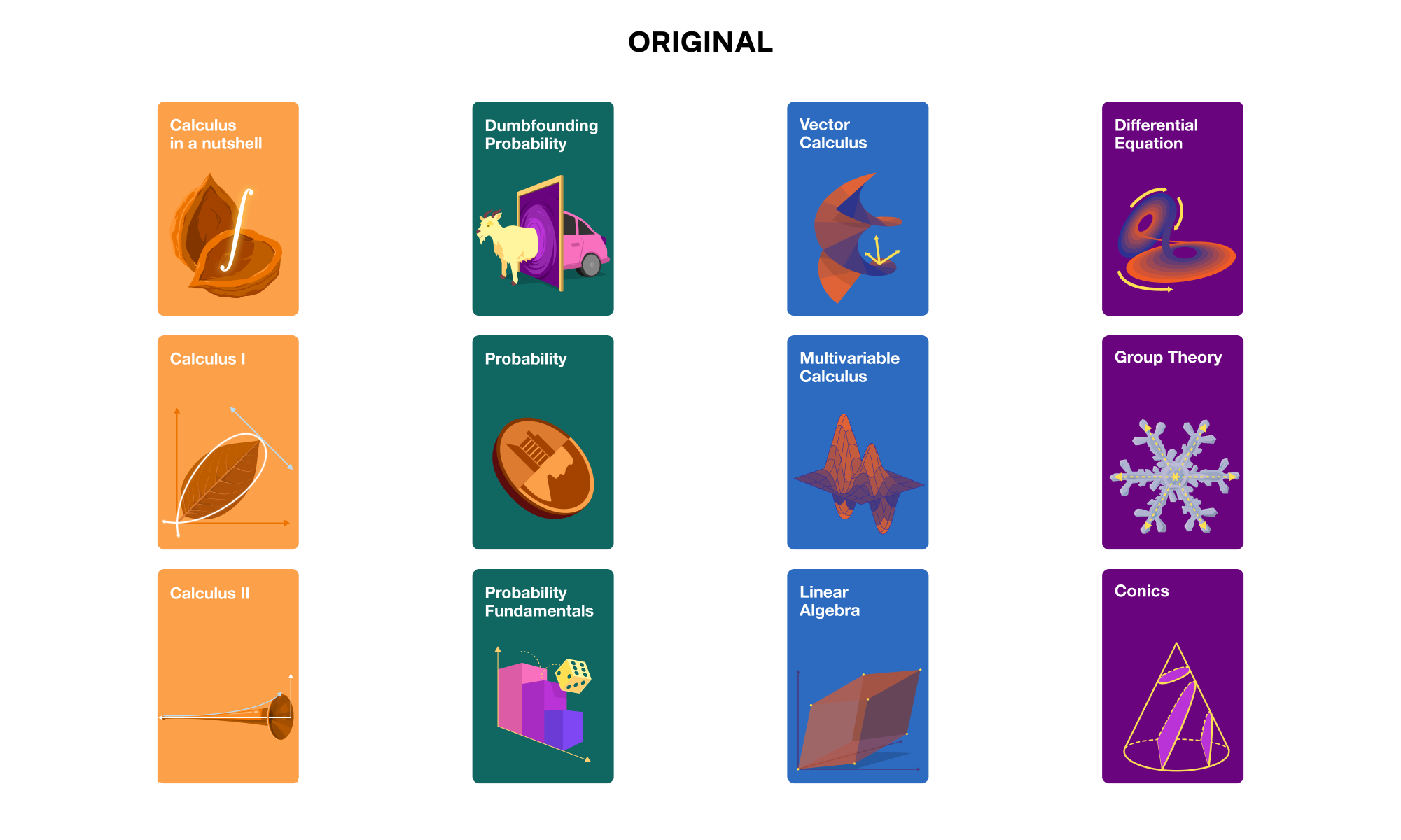
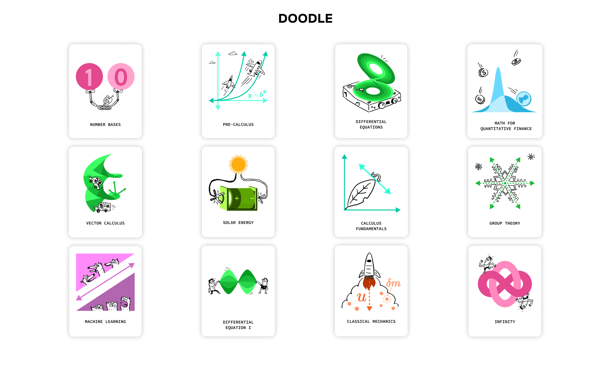
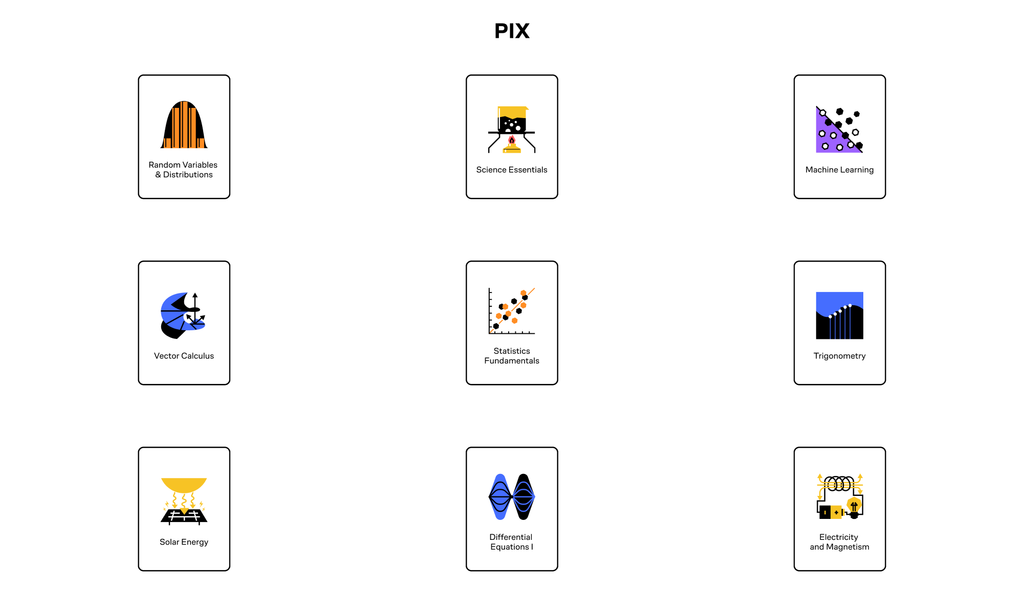

Since joining Brilliant in 2019, I’ve led the illustration work for all course card icons through three major visual transitions, each tied to a broader brand refresh. I collaborated with internal and contract illustrators, and at times, handled refreshes on my own.
Each project cycle lasted about six weeks. With each transition, we introduced a new visual language that shaped the course card designs:
2019 (Original Style): Focused on incorporating real life objects and graphic treatment of STEM objects to create an eye-catching composition.
2020 (Doodle Style): Introduced playful, sketch-like elements inspired by textbook doodles. I reimagined STEM visuals—like graphs and formulas—with whimsical details.
2021 (PIX Style): Focused on bold, minimal, geometric designs. Icons were simplified to feel iconic and instantly recognizable.
2024 (Brand Refresh Style): Created tactile, immersive illustrations that felt interactive and polished—balancing depth and delight.
Throughout each update, I ensured the icons remained conceptually consistent while adapting to the new visual direction.
Outcome
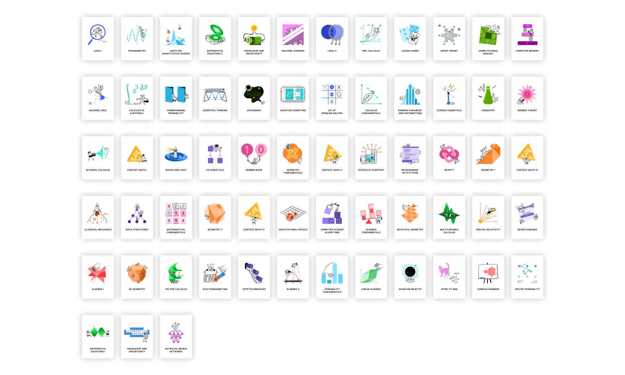
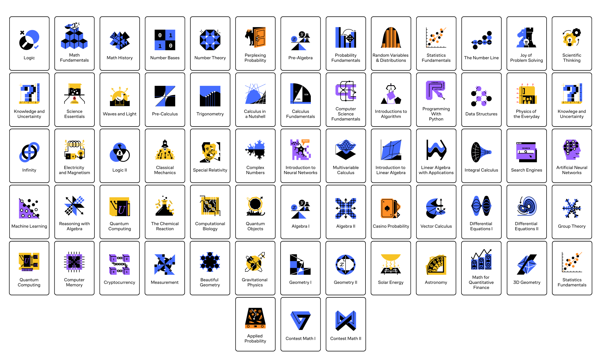
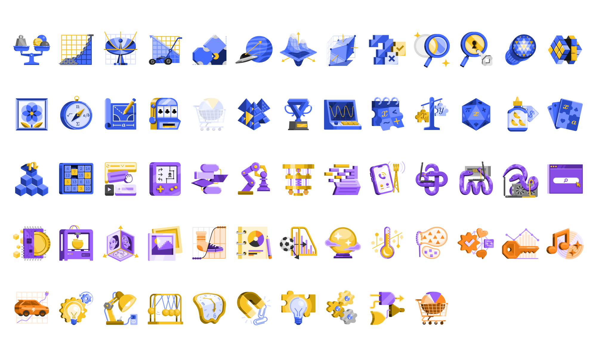
Each brand transition produced a more refined and cohesive set of course card icons that matched Brilliant’s evolving tone and audience. The most recent version feels the most mature while still carrying the charm that makes learning engaging.
All icon sets are now stored in a centralized asset library, enabling the Design and Marketing teams to easily access and implement them across various touchpoints.